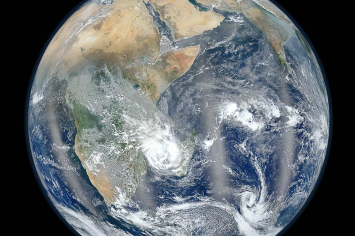
NASA has updated its Climate Spiral visualizer up till 2022 and is now available in both degrees including Fahrenheit and Celsius. Climate Spiral is a visualization that shows global temperature anomalies on a monthly basis between the years 1880 to 2022.
The original version of the Climate Spiral was first published on 9th May 2016, showing temperature rise till 2020. But recently NASA has updated, year 2022 to its latest version.
This visualization is developed from the data available at NASA’s Goddard Institute for Space Studies (GISS). It shows temperature anomalies from the base period of 1951 to 1980. The Climate Spiral is designed by climate scientist Ed Hawkins from the National Centre for Atmospheric Science, University of Reading. It creates a map of global temperature rise due to human activities.
The visualization chart has the year in its center and the months of the year around on the outside along with the radius. There are five concentric circles labeled with negative 2 degrees Fahrenheit to 2 degrees Fahrenheit with an outer ring with the largest value. Here, cooler temperatures can be characterized by whites and blues while the warm or hotter temperature is defined by oranges and red colors. It also defines that more human interaction has caused the global temperature to rise with the changing time.
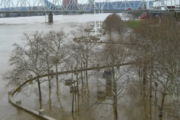
- 101 Dead in Spain, 62,000 Across Europe in 2024: WHO Urged to Declare Climate Change a Health Emergency
- All-Perovskite Solar Hits 30.3% Certified — Zero Silicon, 28% Flexible, and 92% Stable After 1,000 Hours
- EU Bans Burning Unsold Clothes From July 2026 — 80% of Discarded Fashion Still Hits Landfills or Incinerators
- EU’s Digital Product Passport Registry Goes Live July 19 — 53% of Green Claims Won’t Pass the New QR Code Test
- Wear Your Strength on Your Sleeve: The Rise of Statement Watches for Women
These visualizations have been distributed widely around the world while a version was part of the opening ceremony of the Rio de Janeiro Olympics. Now it is downloadable in both degrees.